Last Updated September 27th, 2019
Google Web Font: 20 Best Free Fonts for Stunning Web Typography
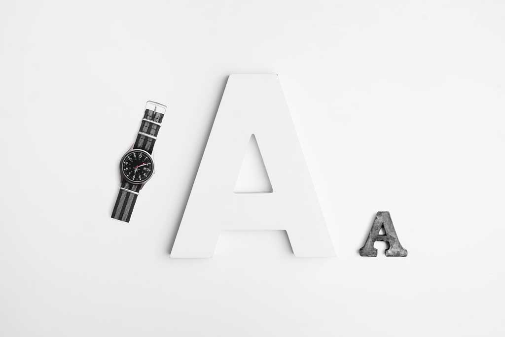
Choosing the right Google web font for your web design project is the quickest way to add some personality and character to your design.
Google web font is a collection of some of the best free web fonts you can find on the web.
As a result, I love exploring and using Google web fonts for every single website project I am working on and so far, I’ve used over 30 different fonts in different projects.
Out with the old and in with the new
The default system fonts just seem outdated, although, not Helvetica on Mac OSX. I love Helvetica.
I’m always very careful when it comes to choosing the right font for any design.
And not just for website design alone.
So over the years, I’ve grown more comfortable and confident with some the fonts I will be showing you in a minute.
My design style as always is to keep things simple.
From colours to font size and font weight, I’m always trying to find the right balance and as a result, I have quite an experience working with Google web fonts.
Before we proceed, let me shed some light on what web safe fonts are and why you shouldn’t be bothered about it when using Google web fonts.
What are web safe fonts?
We generally refer to fonts that are preinstalled on a vast majority of computer operating systems by default as “Web safe font”.
As a result, using uncommon or custom font will certainly alter the typography of your website across different devices.
Some popular web safe fonts include;
- Arial
- Georgia
- Tahoma
- Comic Sans
- Times New Roman
- Verdana
You can find these fonts preinstalled on various operating systems by default.
Are we here to talk about web safe fonts, certainly not. It was only worth a mention.
But with Google web fonts, you don’t have to worry about a font being safe or not.
You simply link the font you want to use and voila, it’s downloaded by your browser.
It is as easy as that.
Therefore in this article, I will be showing you my thirty-five best Google web fonts and how to use them in your web design project.
1. Roboto
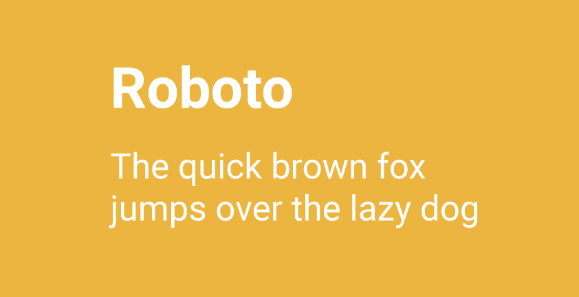
Are you looking for a web font that is classy yet easy on the eyes? Roboto to the rescue.
Besides, you really can’t go wrong with it, trust me.
Google developed Roboto as a default system font for its Android operating system.
Similarly, Google has adopted the same font for their software product.
You can use Roboto for both heading and paragraph and it pairs nicely with other fonts on this list.
2. Open Sans
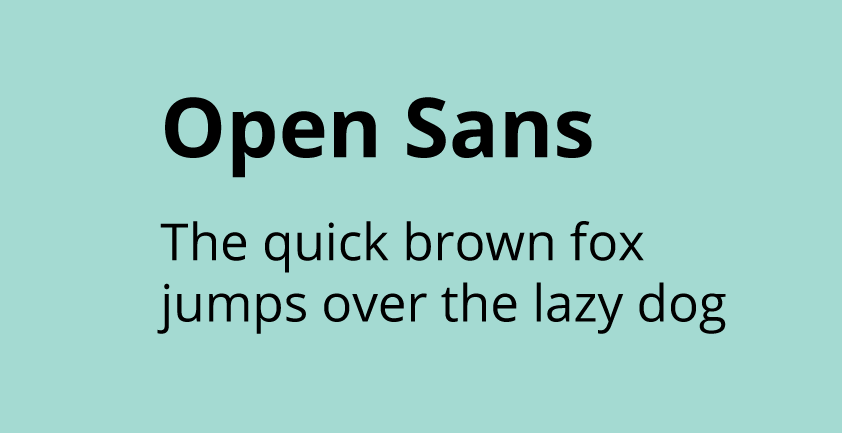
I love the similarity between Open Sans and Roboto and as a result, they are very interchangeable.
Open Sans works perfectly well for heading and paragraph text. You only need to play around with the font weight and font size to find a perfect balance.
3. Lato
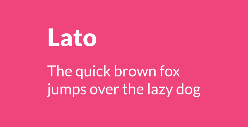
My third most favourite font is Lato. In fact, It is currently the font I’m using on this website and it looks awesome. Doesn’t it.
Lato is a sans-serif font and it is perfect for heading and paragraph text.
4. Oswald
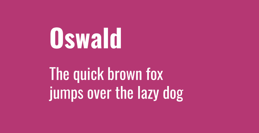
Looking for a font that adds a twist to your design? Oswald got you covered.
It works very well for website headers and pairs very well with Lato.
5. Raleway
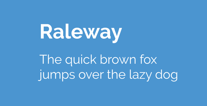
Raleway is an elegant sans-serif typeface family intended for headings and other large sizes.
And with over 18 different styles to choose from.
Although I don’t use it as often as the first four on this list, it is still one of the most popular fonts on Google web font collection.
Raleway pairs nicely with Roboto.
6. Noto Sans
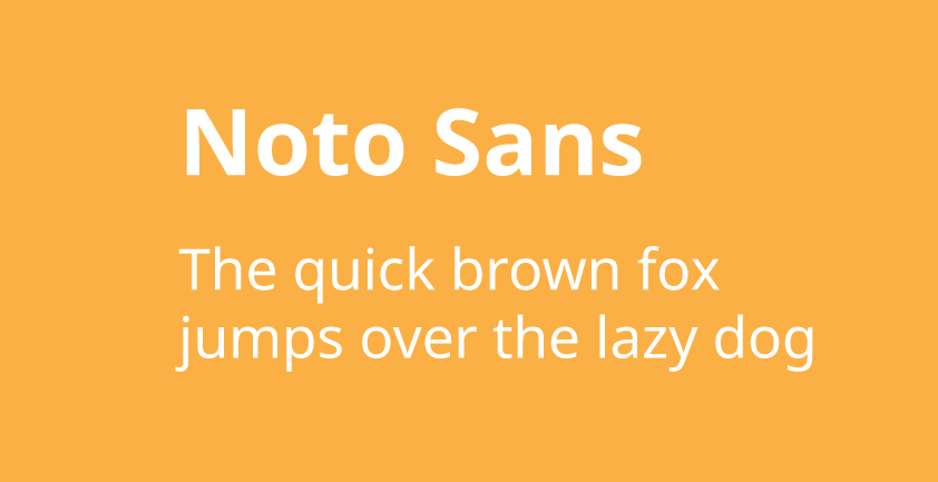
Similar to Roboto, Noto Sans is also developed by Google. It is a beautiful and harmonious font that pairs nicely with Open Sans.
7. PT Sans
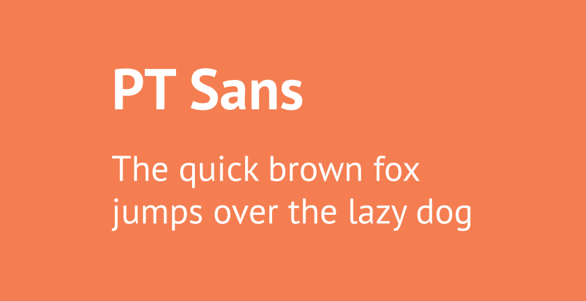
Another beautiful sans-serif font that pairs nicely with Open Sans. Although quite similar to Lato, I love it for its unique personality and character.
Feel free to use for your headings and paragraphs.
8. Ubuntu
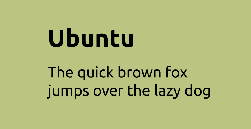
According to Wikipedia, Ubuntu is designed to be a modern, humanist-style typeface and I think its designer Dalton Maag, did a fantastic job.
Although I don’t use it that often, I find it very useful in adding character to your web typography.
9. Nunito
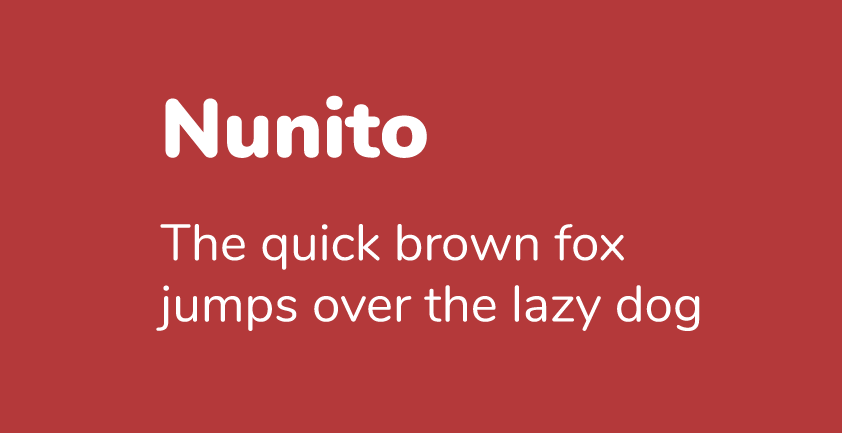
This is a well-balanced font with a beautiful personality. It is easy on the eyes and works straight out of the box.
My first experience with Nunito was for a website design for a delivery service and I was very pleased with the result.
10. Fira Sans
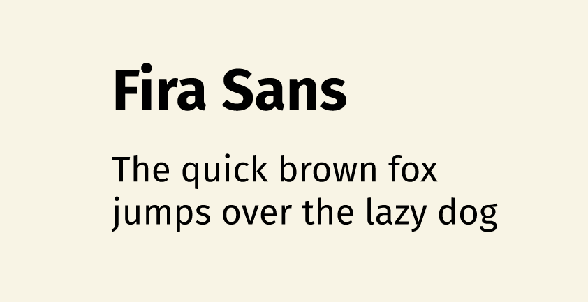
Fira Sans is another beautiful sans-serif font that works well with other fonts.
Because of its varying thickness, I prefer to use Fira Sans in my header for more emphasis.
11. Noto Serif
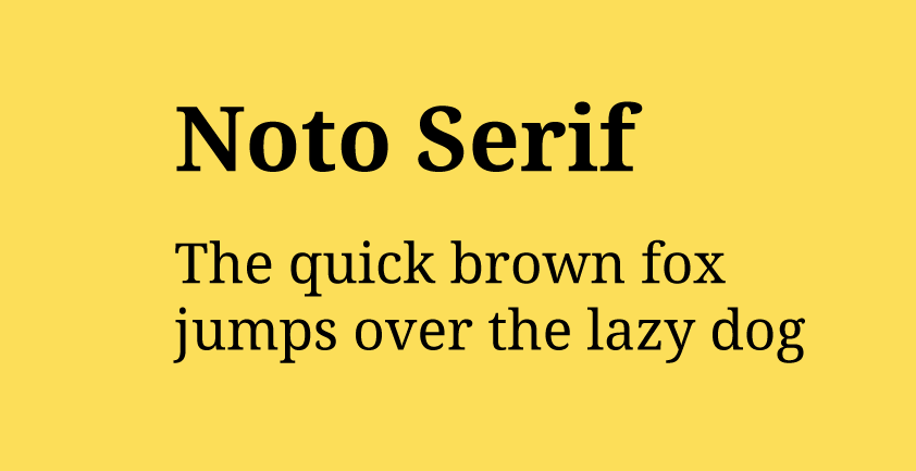
Noto Serif is the serif alternative to Noto Sans and is also designed by Google.
This font works very well for heading and paragraphs, especially in blogs and news websites.
12. EB Garamond
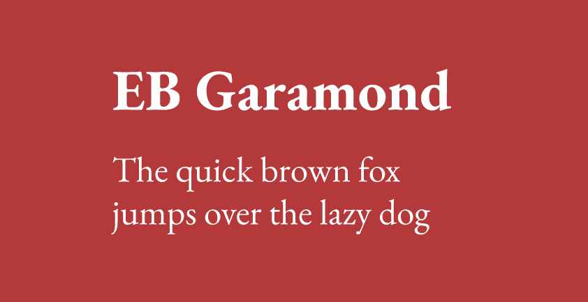
This is without a doubt an excellent and classical serif typeface. It pairs nicely with most sans-serif font on this list.
It is suitable for headings and works exceptionally well when paired with Lato for paragraphs.
13. Quicksand
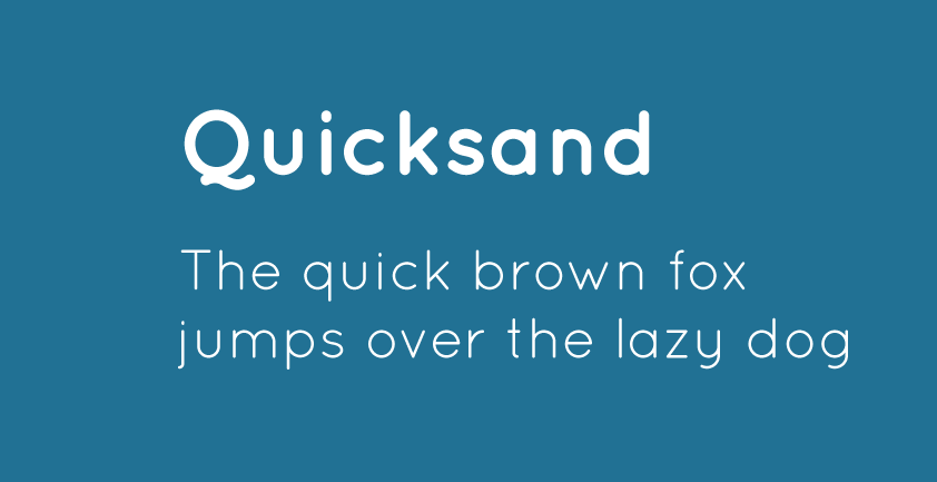
Quite similar to Nunito in personality but unique in its own right. Quicksand is perfect for headings and paragraphs.
Quicksand also pairs nicely with other sans-serif fonts on this list.
14. Libre Baskerville
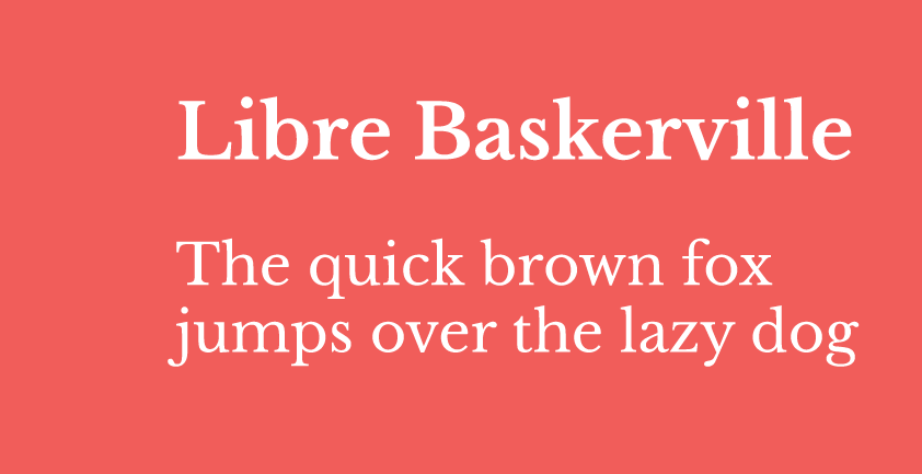
I typically don’t use sans-serif fonts for my paragraphs but this font works extremely well for that purpose.
It is easy on the eyes, especially for lengthy reading.
15. Montserrat
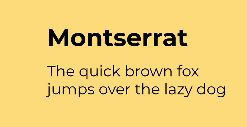
Need a font to emphasize your headings? Think no further.
Montserrat is bold and beautiful, as a result, it is featured in over 9.4 million websites with over 6.47 billion requests weekly.
Need I say more?
16. Roboto Slab
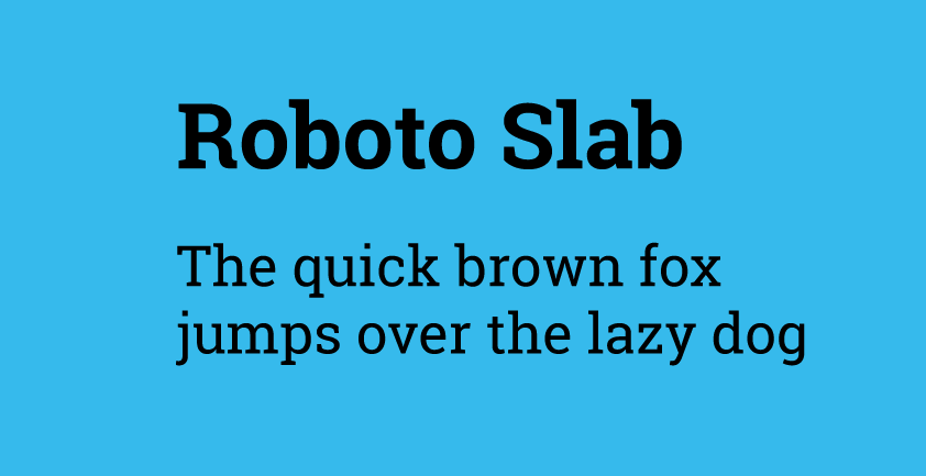
Most noteworthy of this font is its geometric form. Its slight open curves give it a friendlier personality.
I love using this font for heading because it suits my designs better.
And it pairs very well with Roboto or Lato.
17. Source Sans Pro
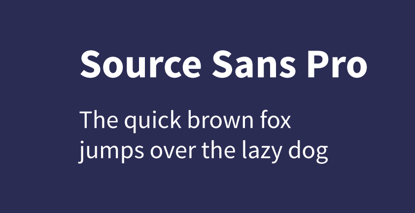
I use this font very often in my designs because it works very well in user interfaces and has a variety of styles to choose from.
18. Merriweather
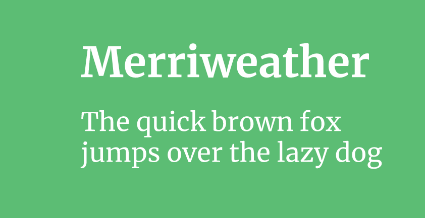
Merriweather is a very pleasant font for reading, especially on screens. It pairs well with Open Sans, Roboto and Lato.
19. Rufina
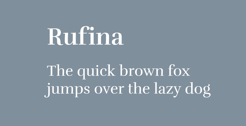
Amongst all the other fonts I’ve listed above, this is one of the least popular. Its a sans-serif font with its own personality. Elegant yet subtle.
Using it on a few projects made me fall in love with it.
20. Arsenal
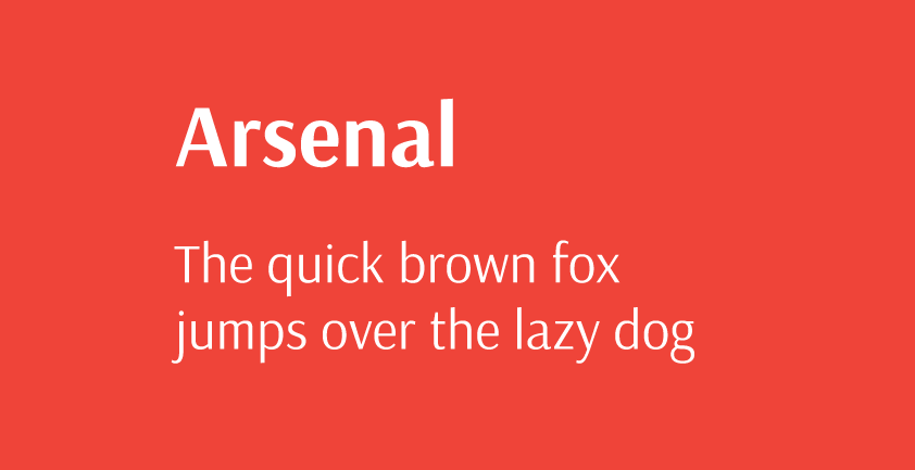
This font is primarily designed for body text and intended for professional visual communication according to Google.
But it looks awesome.
It also pairs quite nicely with Roboto and Lato.
So there you have it.
These are the top 20 Google web fonts I use regularly on various web design projects.
Hope you enjoyed it and found some of the useful.
How to use Google fonts
There are two easy ways to use Google web fonts in your web design project.
You can either link it directly from your HTML file or import it via CSS.
Via HTML file
You can use the link tag within the HTML head tag to request any Google web font like so;
...
<head>
    <link href="https://fonts.googleapis.com/css?family=Arsenal&display=swap" rel="stylesheet">
</head>
...
or
Via CSS file
You can import any of Google web font within your CSS file like so;
<style>
    @import url('https://fonts.googleapis.com/css?family=Arsenal&display=swap');
</style>
Once you have successfully linked or imported the Google web font of your choice, you can then style your text using the CSS font-family property like so;
font-family: 'Arsenal', sans-serif;Where Arsenal is the name of the font.
